With the advent of all-in-one computers in your pocket, otherwise known as smartphones, companies have seen an increasing need to move toward responsive design which allows users to view the website on a mobile device and have a great mobile experience.
However, there has been massive oversight with the biggest companies which has cost them billions. This oversight that companies such as Facebook, Google, Paypal, and many other billion-dollar corporations has committed has cost them dearly. This oversight is not the lack of responsive design, but the improper implementation of it.
Responsive design is critical for websites in today’s age when as many as more than half of website visitors are viewing from a mobile device. This means that as the screen size changes, the website “responds” to the screen size, and changes size. This is apparent for example if you are on a desktop and viewing this website, and you resize your browser window, the elements move around. This doesn’t happen automatically. During the web design every screen size must be taken into account, and the site designed around that.

However, what the companies fail to recognize is that while half of users are one a mobile device, the other half of users are still on a desktop, and this is not going away. The problem is that desktop users hate the mobile experience on a large screen. While the mobile experience is excellent for mobile users, it is frustrating to use for desktops.
Moreover, some users hate the mobile experience on some websites even on mobile devices. They will often go out of their way to try to force their mobile web browser to view the website in “desktop mode” because they hate the mobile experience so much.
Companies such as Facebook, Google, and Paypal have ignorantly forced a mobile-responsible website redesign for desktop users that users hate. It severely limits the user experience on the desktop, and changes to basic functionality of websites the users and companies rely on for both personal and business functions becomes frustrating and time consuming.
As a result, millions of customers decide to leave the company and search for an alternative that offers the same services with a better user experience. The costs of companies failing to consider the user experience of desktop users, and that almost everyone doesn’t care about how it looks as long as it works, has resulted in net losses of as much as billions of dollars.

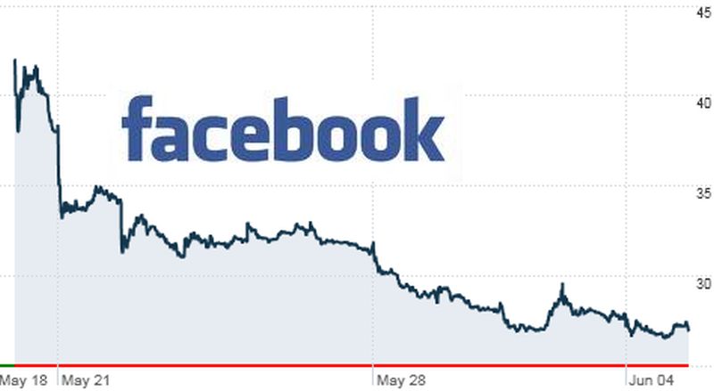
Facebook alone can be seen to have a devastating effect when releasing their unwanted “Timeline” redesign in 2012. Facebook made a massive oversight when they decided to force the Timeline redesign on all of the hundreds of millions of users around the world at the same time as their IPO. Their arrogant ignorance resulted in losses of tens of millions of users, and ultimately resulted in a failed IPO with one of the biggest failed stock prices of any IPO in history. This was all because Facebook put their own desire for a fancier web design over the wants and needs of the users.
The end result is that no longer is Facebook the ubiquitous social media device that everyone uses religiously. While Facebook used to be synonymous with contact info, most people only have a Facebook account nowadays to be able to easily sign into other websites – not Facebook. The vast majority of Facebook users have abandoned it, and while Facebook used to be the first thing you ask your friends, now no one cares, you can just say, “oh, I haven’t used Facebook in years”.
Facebook is not the only failure as a result of unwanted mobile responsive redesign, however. Google has been systematically ruining all its products, from the vastly unwanted new “compose” window, to the redesign of every one of their services. As a result of this one redesign, Gmail lost millions of users overnight, and tens of millions more are trying to leave Google as quickly as possible. Sure, there are other reasons people want to leave Google, privacy being a big one, but their unwanted forced redesigns are often the straw that breaks the camel’s back.

While Google Talk used to be used by virtually every Gmail user, since they redesigned it as “hangouts” in an unwanted mobile responsive redesign, almost no one uses hangouts. Paypal recently forced a completely new responsive redesign, hated by all Paypal users everywhere, and as a result they lost millions of customers that didn’t want to have to learn where everything was all over again, not to mention that their redesign only half-works across the site and still has many bugs over a year later.
All these companies could have saved themselves by merely leaving things as they were, and making the mobile responsive redesign only apply to mobile devices for better mobile usability, while desktop devices would stay exactly the same. This massive oversight is costing millions of dollars in lost customers and lost viewers per year, and before you know it the net losses will be in the billions. All because the companies failed to listen to the customer and decided to do what they wanted anyway. They paid dearly for this mistake.


